Is your business in need of iOS app design? Don't know where to start? Do not worry. Designing iOS apps is similar to designing apps for other operating systems. However, the platform is slightly less flexible than other platforms like Android, and businesses must follow important principles when developing apps on this operating system. Let's take a look at 10 rules to pay attention to when developing iOS apps!

Carefully choose the color scheme for your iOS app, because the way you choose the color layout will greatly affect the user experience and the perfection of the interface.
PSA Solutions recommends using a design color scheme that is consistent with your brand's colors for all images. Using solid colors also makes it easier for users to distinguish and remember your brand compared to other brands.
PSA Solutions recommends using tint colors (combining the traditional color palette with white) for app elements used to interact such as buttons, selection keys, taskbar,... Tint colors are more saturated with white color. A brighter appearance will help the buttons not occupy much attention and annoy the users. If you apply the right color, it will be much easier for the user to distinguish static elements from interactive ones.
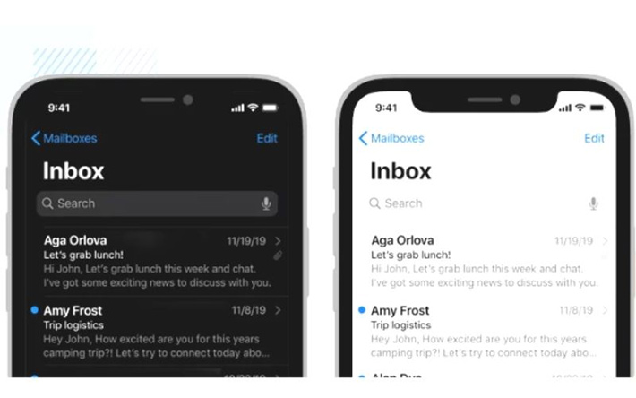
Finally, make sure that the color scheme when designing iOS apps is suitable for both light and dark environments. Make sure that your app is eye-friendly: its colors stand out when used outdoors, and soften when used in dark spaces.

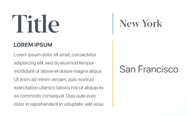
There are no rules when setting up fonts for your iOS app, but PSA Solutions recommends using 2 custom iOS default fonts: San Francisco (sans serif) and New York (serif). Apple has designed these fonts with both great extensibility and adaptability for many different interface styles. Take advantage of them to make the app browsing process on the Appstore faster.

For most text styles displayed on the app (such as navigation or tutorials), PSA Solutions recommends using the San Francisco or New York font as the majority of iOS app users will get used to reading this font.
Besides, there are six different fonts for San Francisco, so you don't need to worry about text hierarchy for your users. Meanwhile, Apple's Font serif (New York) is a companion font for the San Francisco font and is great for headlines.

Increasing brand awareness is a must, but you should understand that your brand image should not take up too much screen space. This can hinder both content and navigation, detrimental to the user experience.
However, there are other ways to reinforce your brand. The easiest and most recommended approach is to apply the same color scheme of your brand colors and use them for different UI elements throughout your iOS app design (mentioned in the first rule). You can use your brand color palette for icons, navigation buttons to highlight text and even more appealing to users.
When it comes to the light and dark look of the design (dark and light theme) iOS apps don't add a light / dark version of your app. You don't want to create separate interfaces that conflict with the entire system on a user's device.
If you do, you could create annoying confusion for the user. This is because they have to turn on and off two sets of switches to control the light and dark interface (of the app and the system).
Next, for accessibility reasons, you'll want to make sure the text in your iOS apps remains easy to read when it's in the dark.
As long as your iOS app has a dark look, you'll also want to make sure there's enough contrast between the text/image background.
Finally, consider designing icons for each light and dark theme when designing an iOS app. To do this, simply design the empty glyphs with borders for the iOS light theme and the glyphs that fill the iOS dark theme.

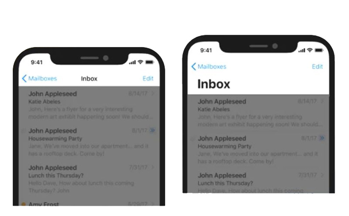
Except for necessary cases, try to avoid interfering with the motion system of the iOS system on all devices running this operating system. Because those motion settings usually allow the user to access the Home screen, Notification Center, app switcher, and Control Center, users are already accustomed to these "motion" gestures on many applications. iOS and often doesn't appreciate having to re-learn new gestures to manipulate an activity. An example would be swiping from left to right to go back to the previous screen.

You can also make your iOS users feel more natural by using iOS haptics-compatible standard UI elements like sliders, date pickers, and settings buttons. Did you know that you can have full access to all these standard elements using Justinmind's iOS element UI?
You can easily design iOS apps, but don't forget that basic programming knowledge is still difficult to meet to overcome Apple’s strict censorship requirements. Therefore, from now on, let's learn about professional application design agencies. These units have better experience in generating ideas, meeting application standards for each operating system, and better support and security policies.